Contest for Nier Re[in]carnation
A brief explanation about my process for making concept art
This image was made for a contest in 2021 with some help from my Art Director, Koshi Tsukamoto who I worked with at Wachajack.
I wanted to create a realistic scene based on a screenshot of the game about a prince and a decomissioned soldier running away from their home kingdom that was about to fall into chaos.
There were brief glimpses of the city from the game, so I had a lot of freedom to work with how the kingdom would look like. What I decided to go for was a large medieval town mixed with some fantasy elements and technology built into it. I felt like trams and industrial smokestacks would also bring out the NieR vibe.
Thumbnails
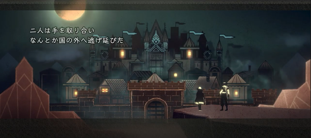
Screenshot from NieR Re[in]carnation
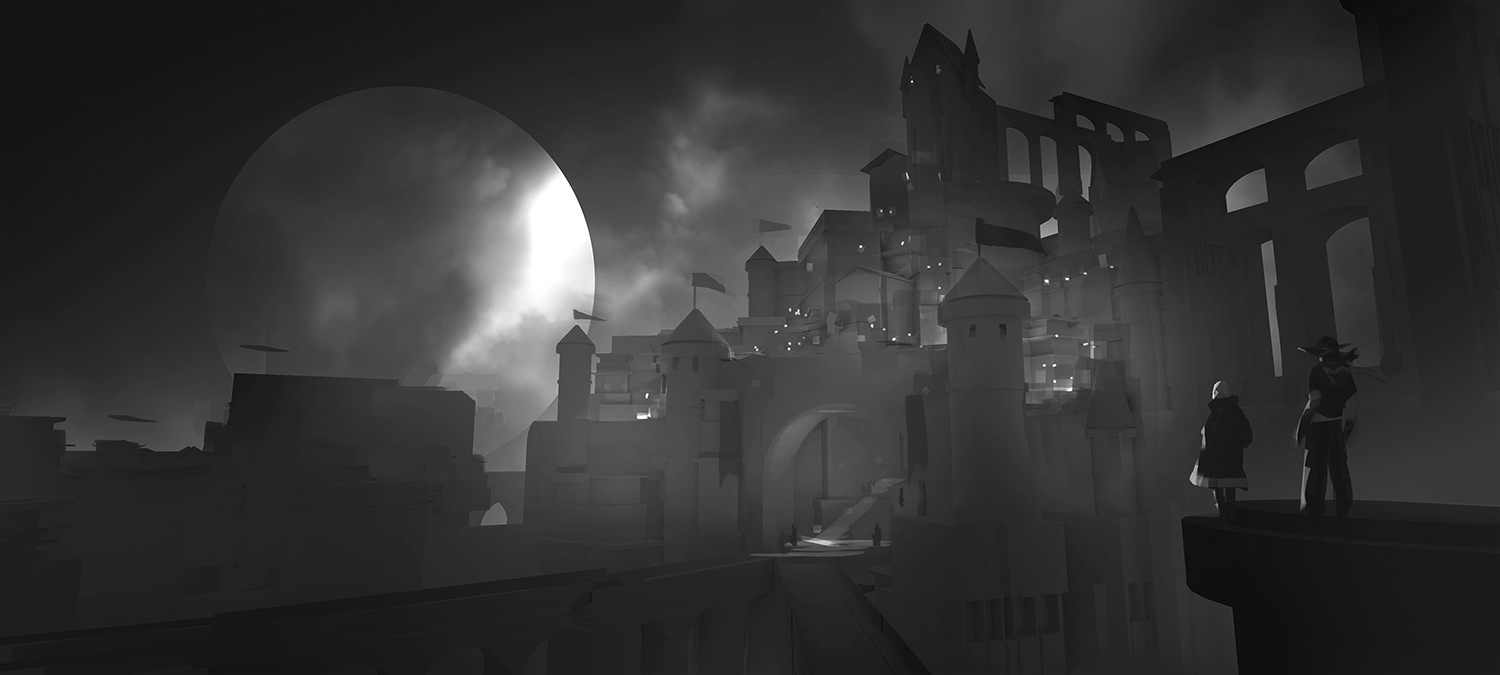
At this stage, I start with creating a few thumbnails in order to get a feel for the direction of how I want the piece to look like. This is probably the most important stage for me whenever I have to start a new piece.
I like to start with explorations and possibilities by doing thumbnails. In general, I have a few ideas of angles that I like and how I would like it to look but I'm indecisive. This is my way of getting it out!
Often times the first images don't always work out but at this stage I try to solve the problems of design, composition, lighting, and mood. The advantage of trying a lot of versions is also an advantage later on if the team ever wants to revert to earlier versions of the explorations.
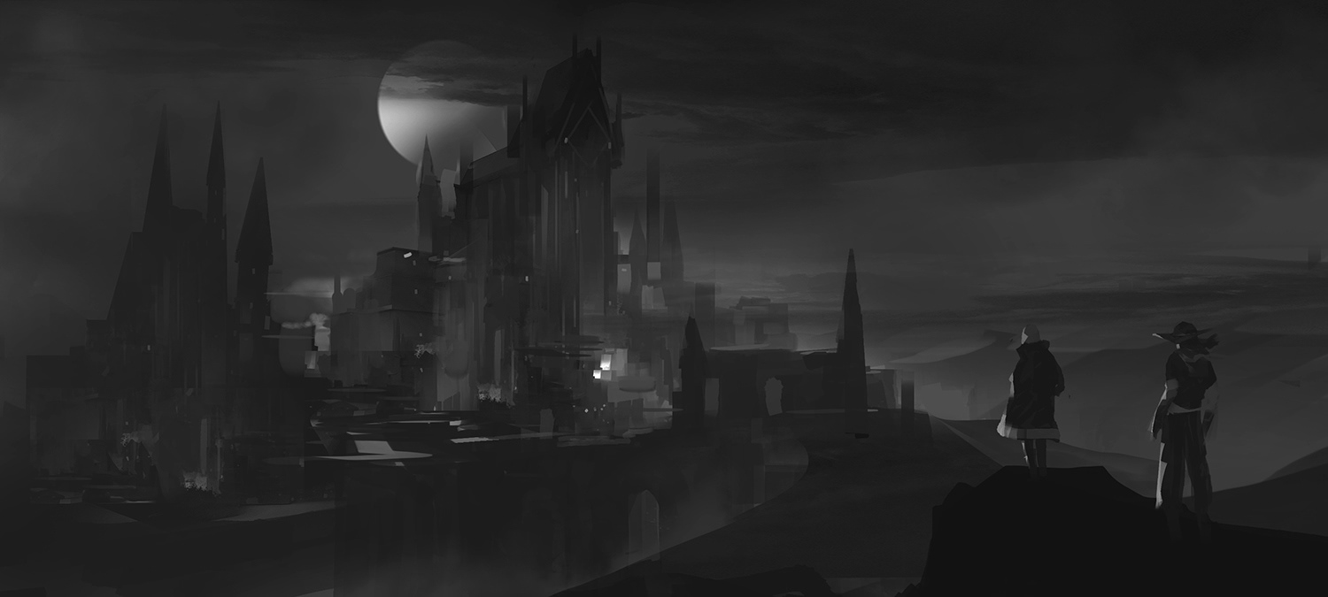
Modeling
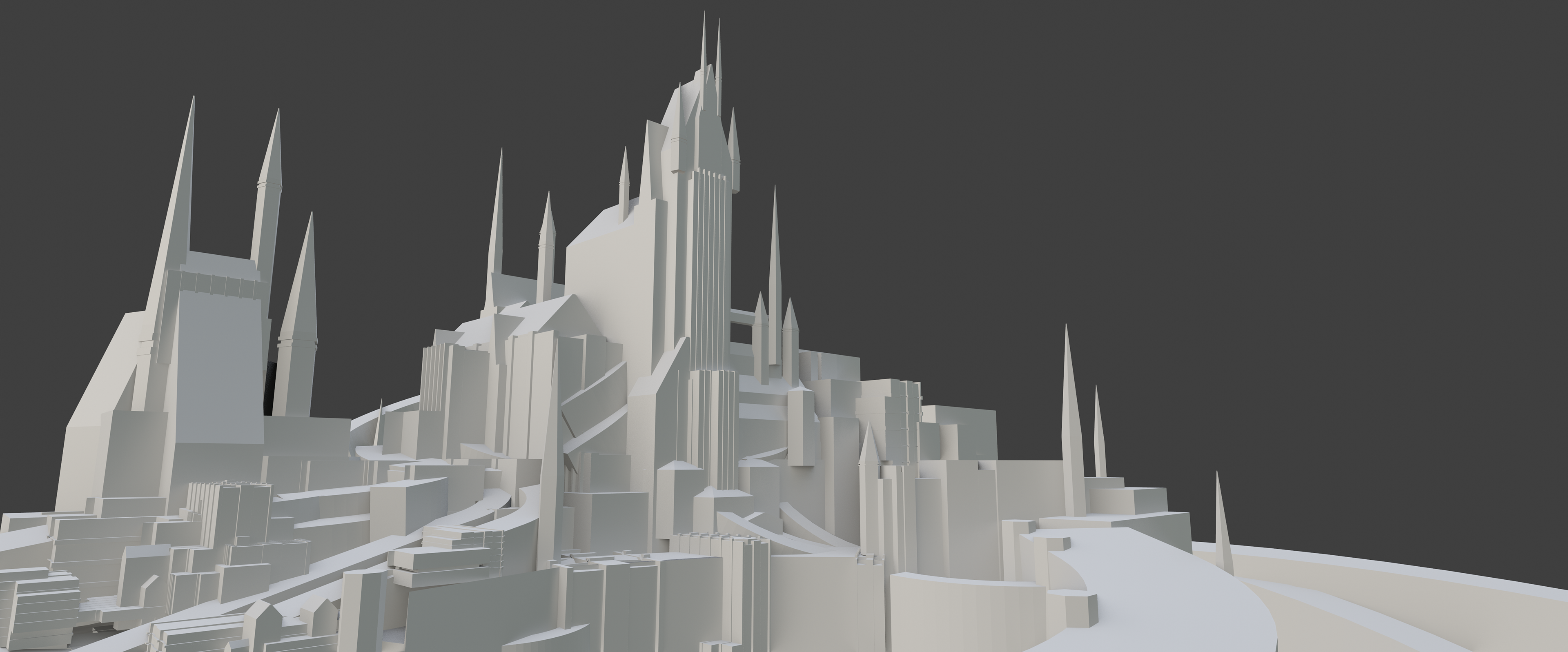
First block-out
I felt like the second image was the one that was most closely resembling the image that was in the screenshot and I thought that mood would be pretty cool.
I started out by blocked out most of the city according to my thumbnail, starting with really simple shapes, getting the camera in the right position and seeing if the building proportions feel good.
Then, I would make a second pass on the more important buildings where the viewer's eye would follow.
It was important for me to balance how detailed certain areas were to others.
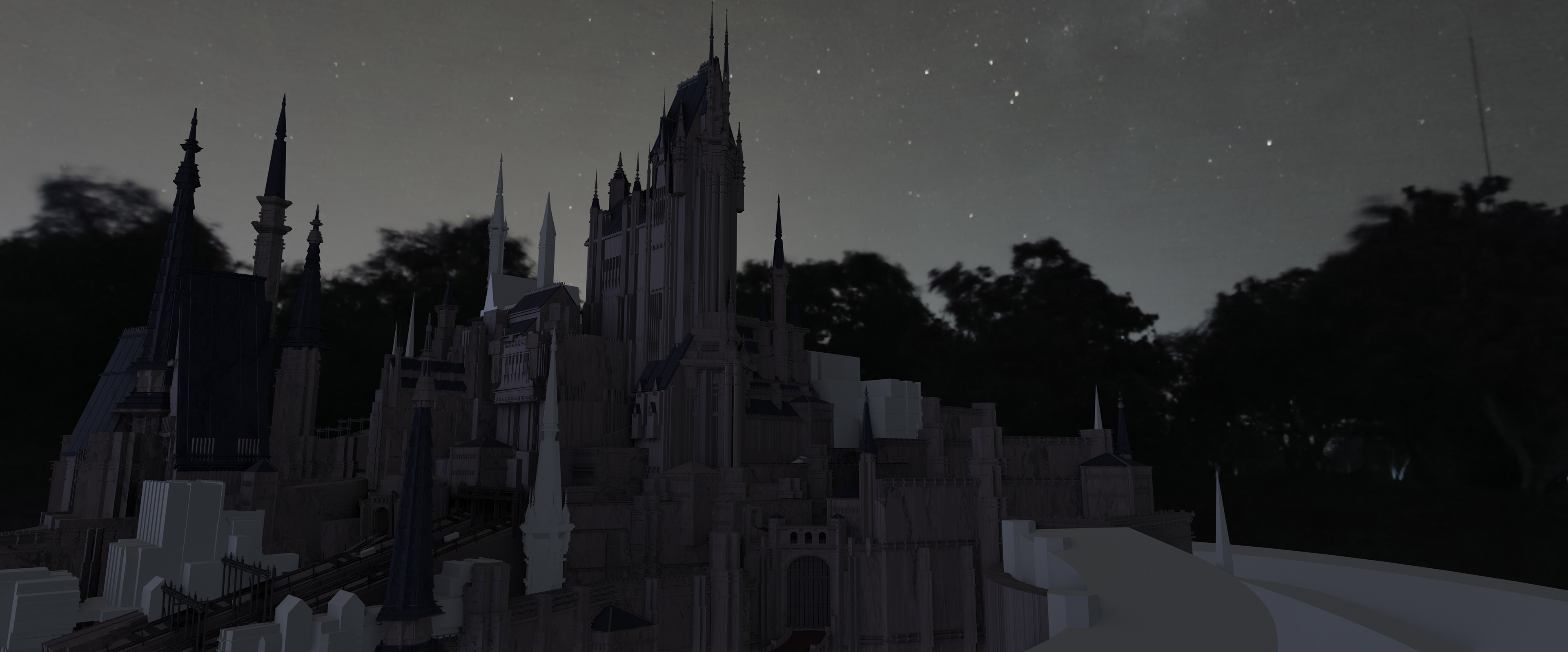
I also often checked the night time version in render view as I was creating the buildings to see if the local values by themselves worked out in darkness.
Then, I would make a second pass on the more important buildings where the viewer's eye would follow.
It was important for me to balance how detailed certain areas were to others.
I also often checked the night time version in render view as I was creating the buildings to see if the local values by themselves worked out in darkness.
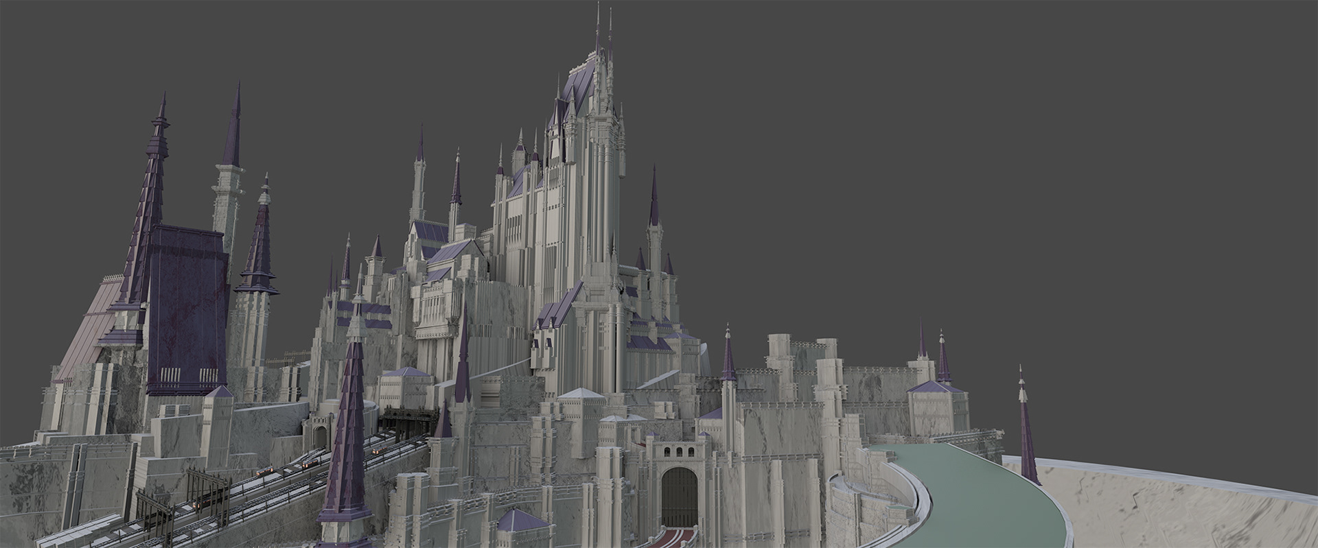
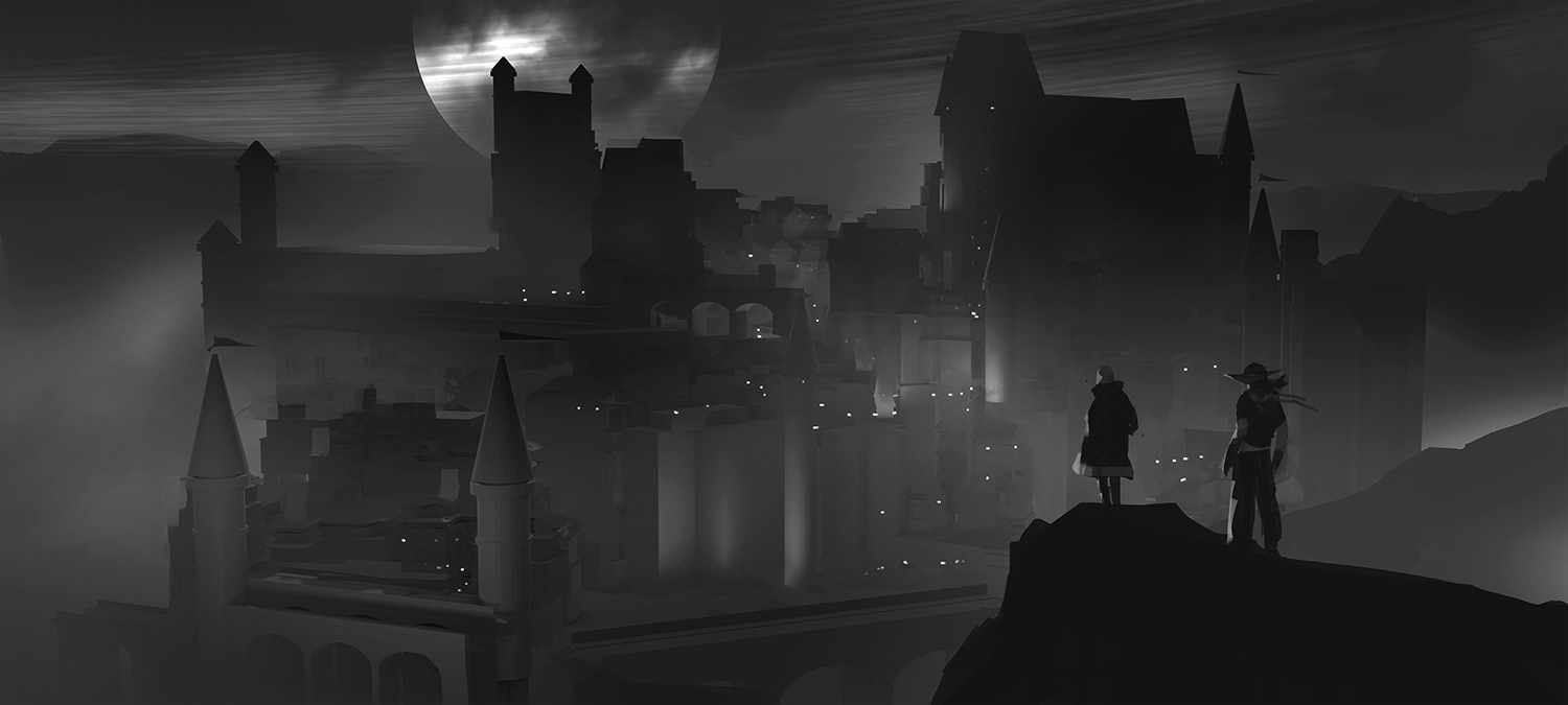
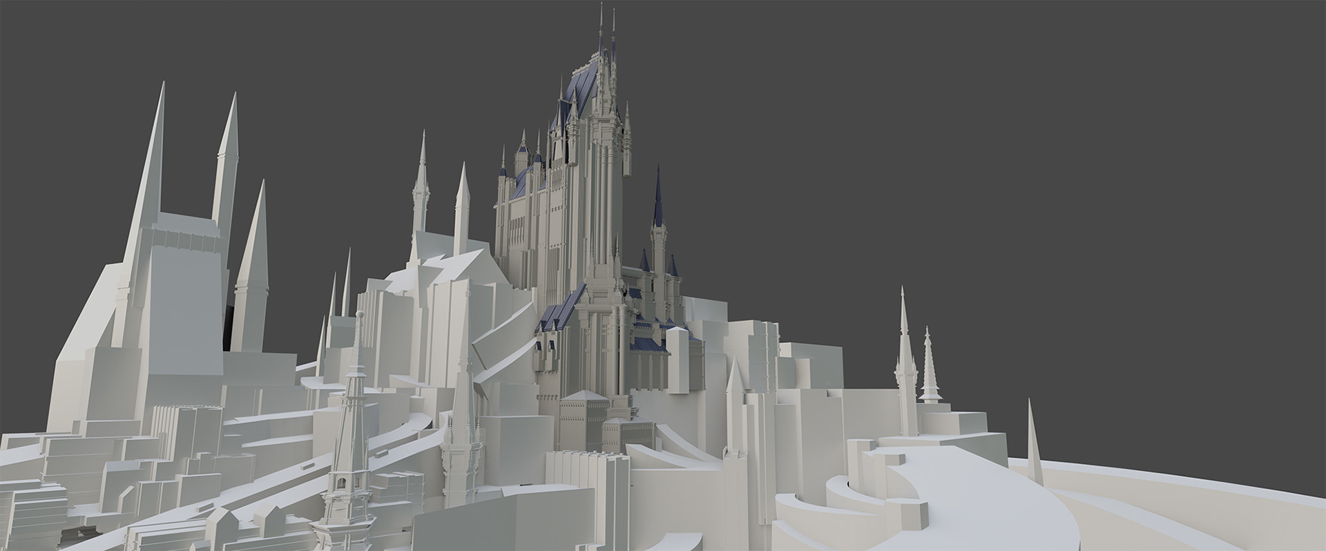
Model with rough textures
Unfortunately, a lot of the details had to be faded out because of the lighting but it was still fun building it anyway :)
Unfortunately, a lot of the details had to be faded out because of the lighting but it was still fun building it anyway :)
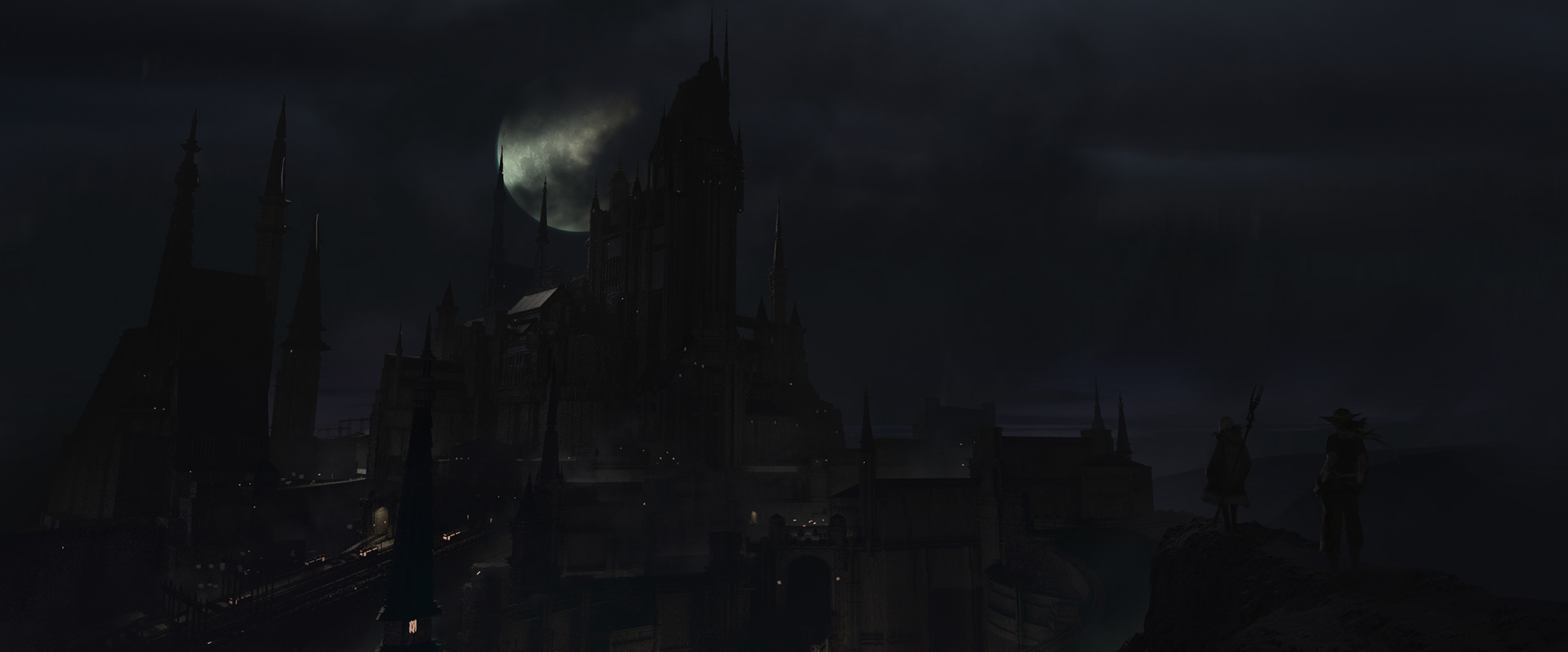
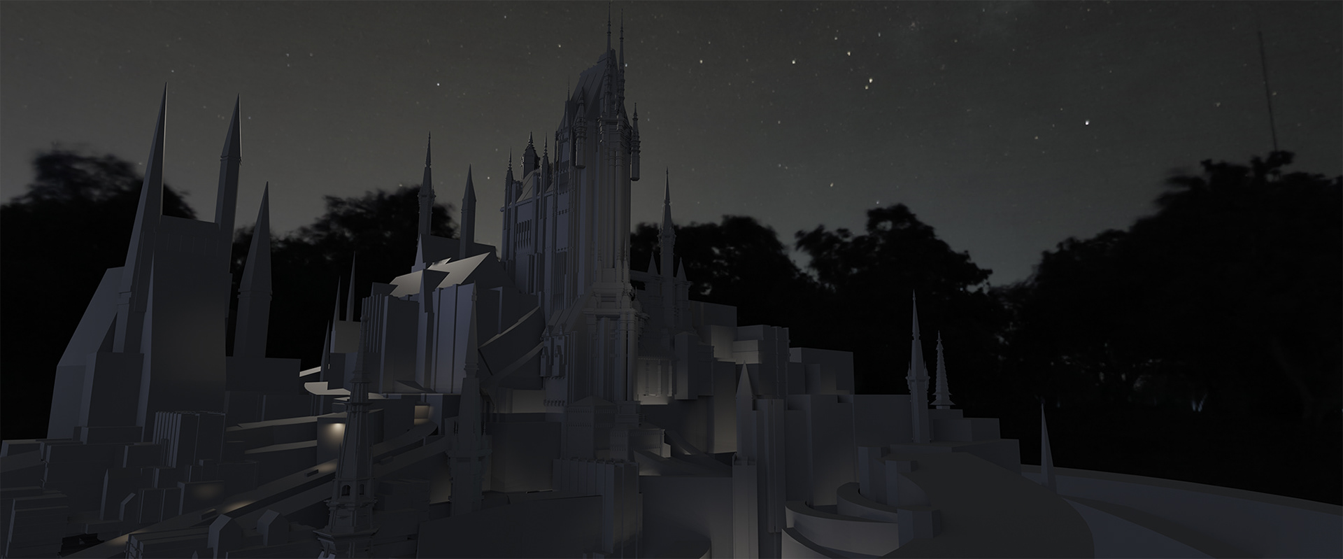
This was the first pass I did after putting the image together in Photoshop. The lighting could have used more work and the values were not really there yet. You really can't see anything!
With some feedback, I was able to tweak the lighting a bit more to get closer to the final result.
With some feedback, I was able to tweak the lighting a bit more to get closer to the final result.
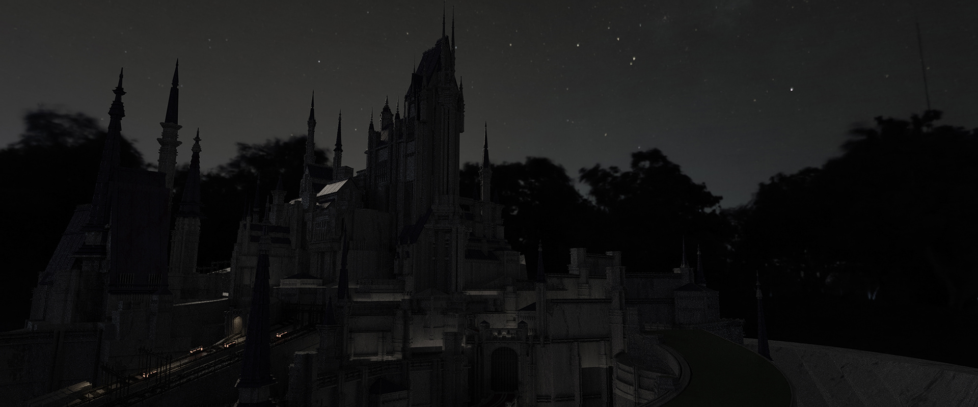
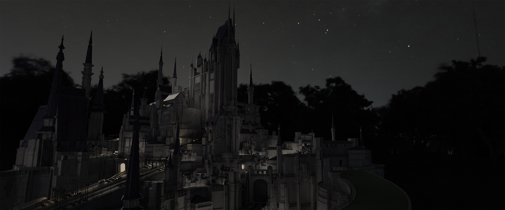
As a solution, I found that it was easier to darken the areas that were lit up than to add light after the render, so I went back into 3D in order to get the lighting to a point that I was happy with before returning to Photoshop.
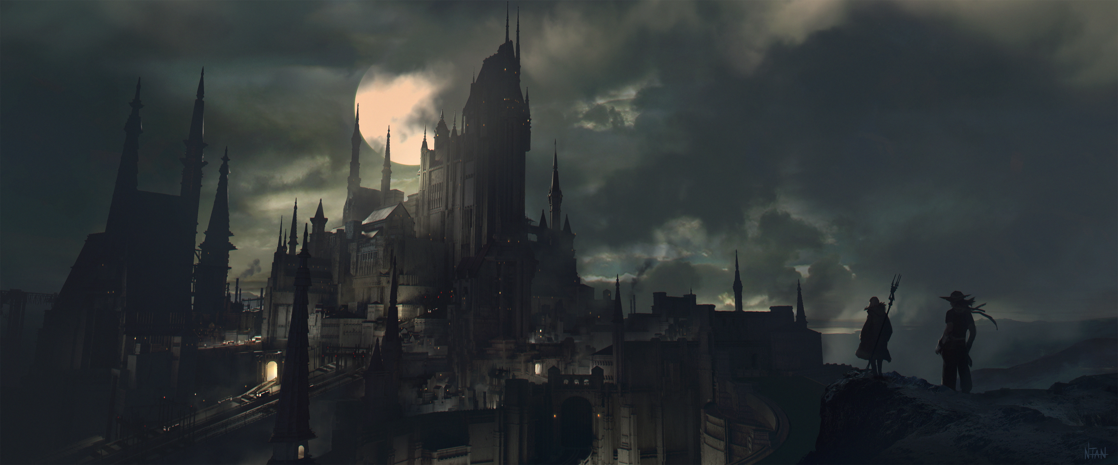
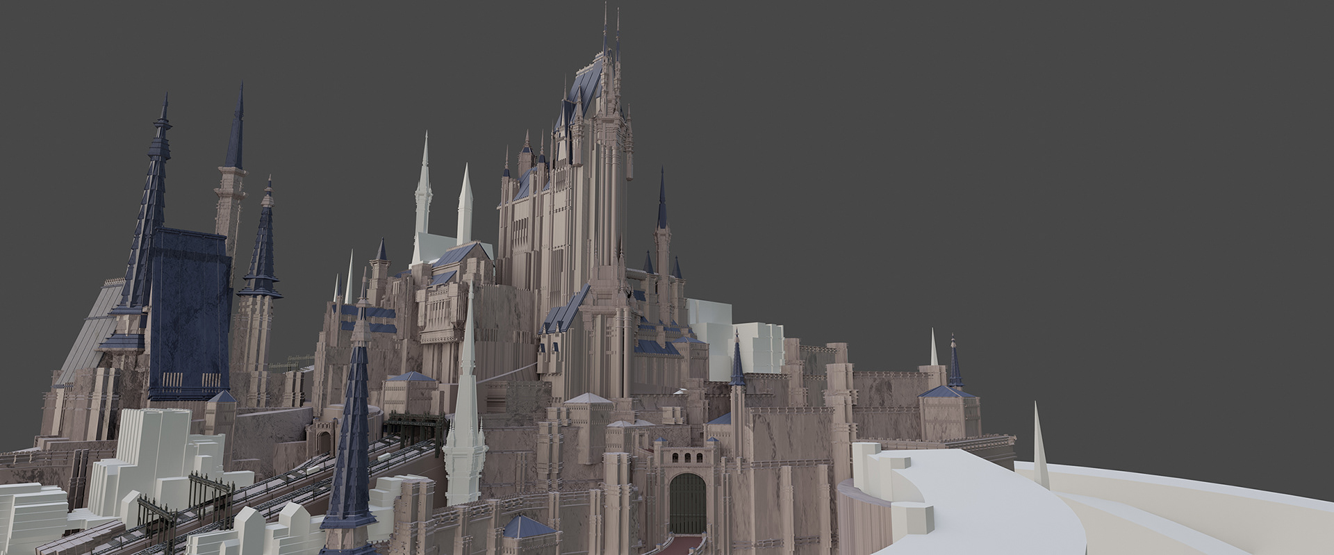
Final Image
I was more satisfied with the image after balancing the lit up areas and also after fading some of the details into darkness. I added some fog to separate layers of the castle walls to create depth and distance.
Even though I didn't win the contest, I was happy to do this work for myself, with the process, and with the end result :)
Even though I didn't win the contest, I was happy to do this work for myself, with the process, and with the end result :)